LinkedIn Email Unsubscribe Redesign
Overview
This case study examines the LinkedIn email unsubscribe and notification management experience, highlighting usability issues that make it difficult for users to stop unwanted emails or adjust preferences efficiently. The redesign focuses on improving clarity, ease of use, and control for users while maintaining LinkedIn's core purpose as a professional networking platform.
Problem
LinkedIn is a leading platform for professional networking, but some users have found that unsubscribing from emails and managing notification settings can be a bit challenging. Feedback from real users helps highlight where the experience could be improved.
"Unsubscribing from LinkedIn emails requires navigating through dozens of toggles and pages. It's exhausting and time-consuming."
"I click 'unsubscribe' but still get emails. The settings are so granular and scattered, it's hard to know what I'm actually turning off."
"The language is misleading. I thought I was unsubscribing from emails, but suddenly my app notifications stopped too, which I didn't want."
Key Features
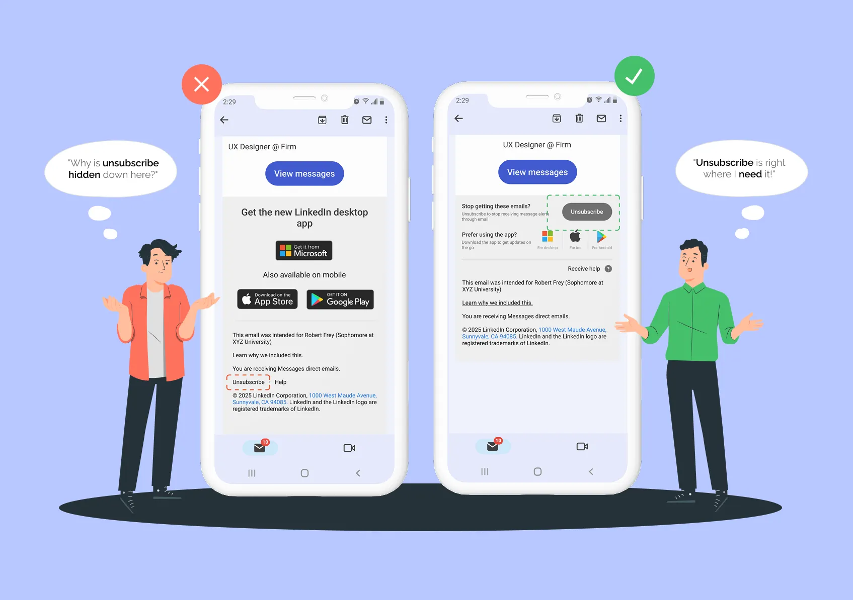
Unsubscribe Button Visibility and Clarity
Problem statement
In the original email layout, the unsubscribe link is small and easy to miss. It is tucked away beneath prominent app download ads at the bottom of the message. This makes it hard for users to find and use when they just want to stop getting emails.
Redesign
In my redesign, the unsubscribe button is much more visible. It is a large and clearly labeled call-to-action right at the top of the footer. This makes it simple for users to spot and use, allowing them to unsubscribe quickly and easily without getting sidetracked by other content.
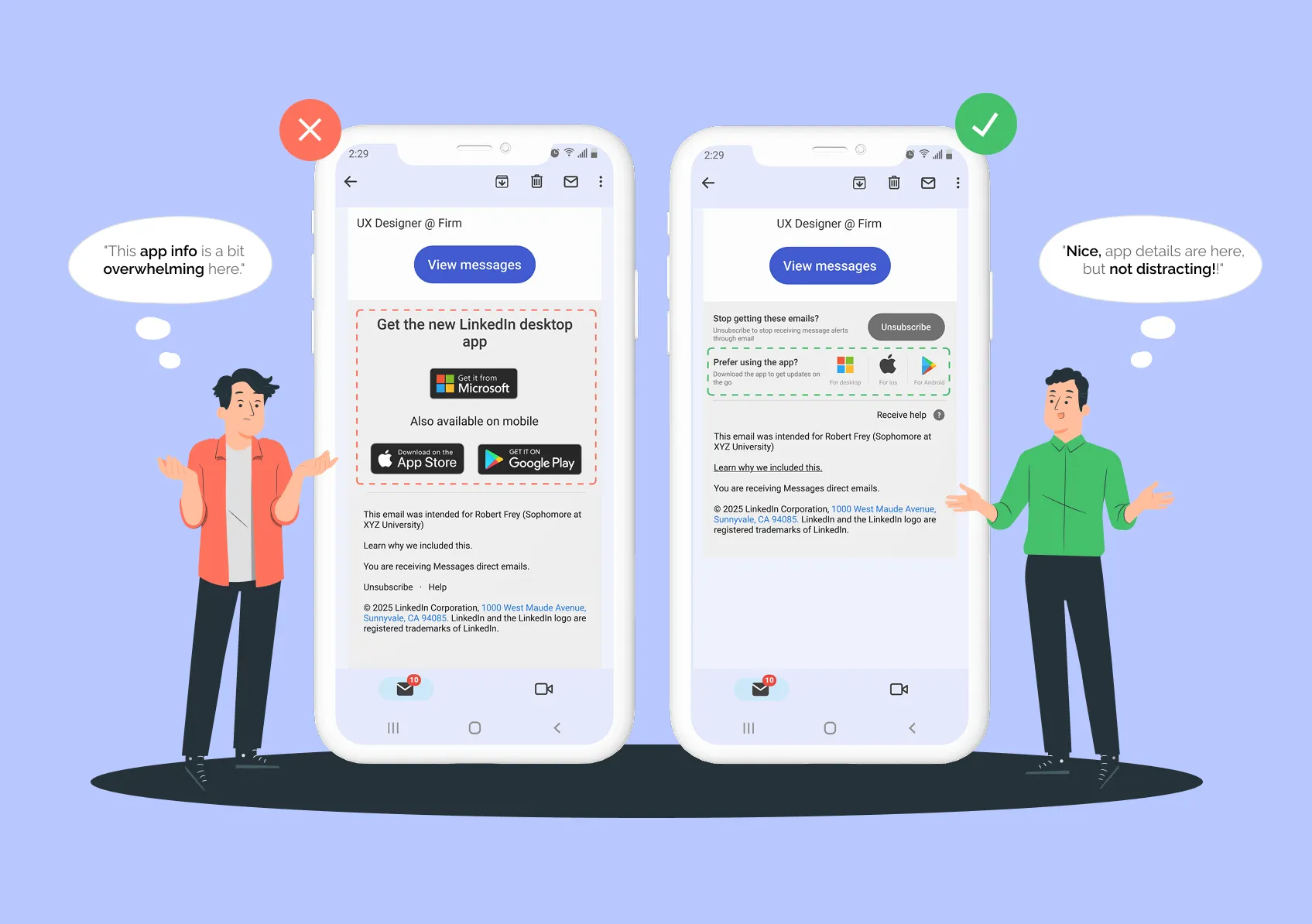
Balanced App Download Placement
Problem statement
In the original design, the app download section is very large and visually dominant. This can easily distract users from the main content of the email, like new messages or notification settings. It makes it harder for users to focus on what they actually want to do.
Redesign
In my redesign, the app store badges are made smaller and moved below the main content and actions. This change keeps the user's attention on what matters most in the email. Users still have the option to download the app if they are interested, but the overall experience feels more balanced and less overwhelming.
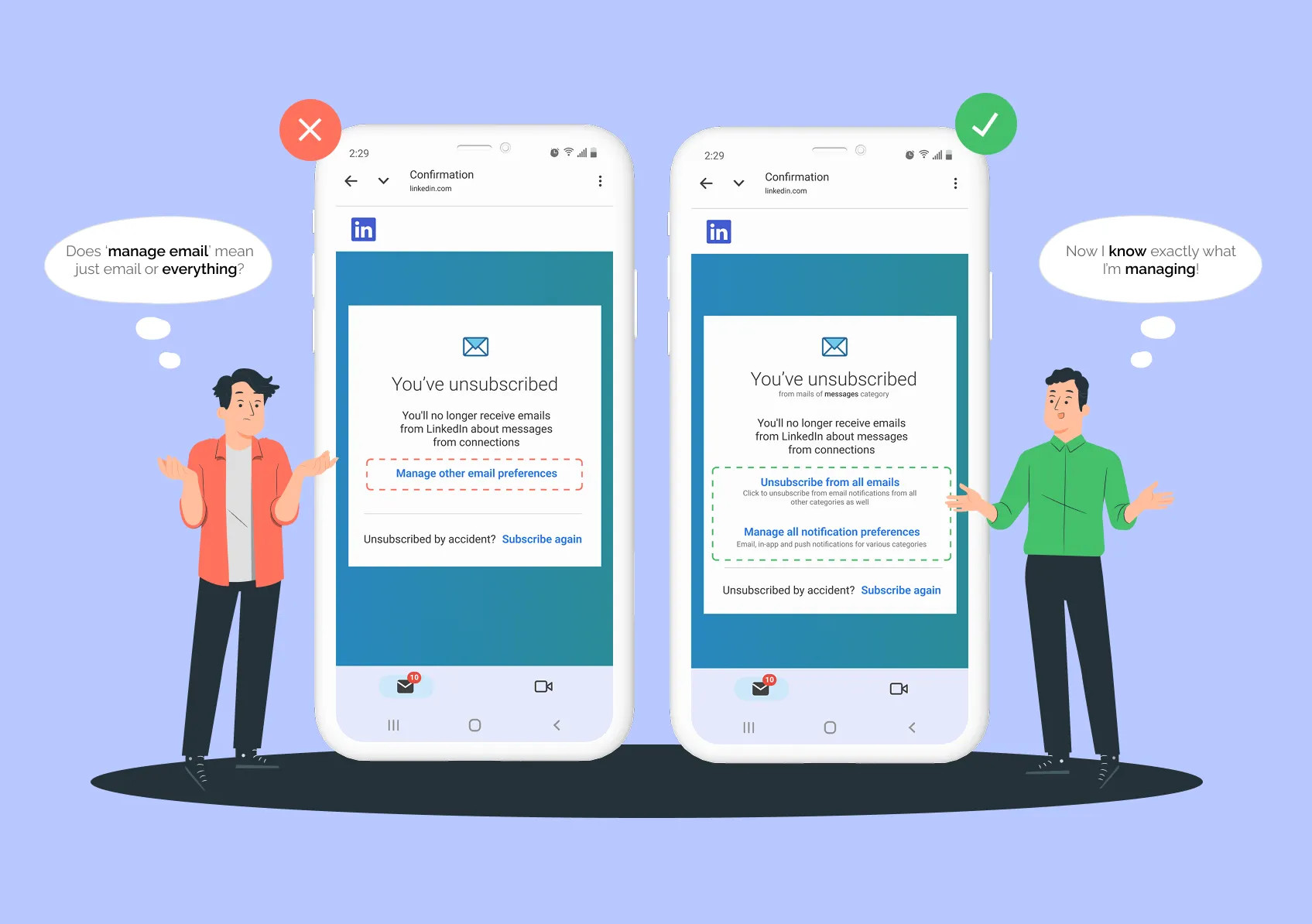
Clearer Language in Unsubscribe Confirmation
Problem statement
After unsubscribing, LinkedIn's original confirmation uses wording like "Manage other email preferences." This can make users think they are only changing email settings. In reality, the linked page also controls push and in-app notifications. This can lead to confusion and accidental changes to settings users did not mean to adjust.
Redesign
The improved confirmation screen uses clear and direct language. It tells users they have unsubscribed from emails in the messages category. Users are also given the option to unsubscribe from all emails if they want. There is a clearly labeled link to manage all notification preferences, making it obvious that this includes email, push, and in-app notifications. This approach helps users understand exactly what they are managing and builds trust by making the process transparent and easy to follow.
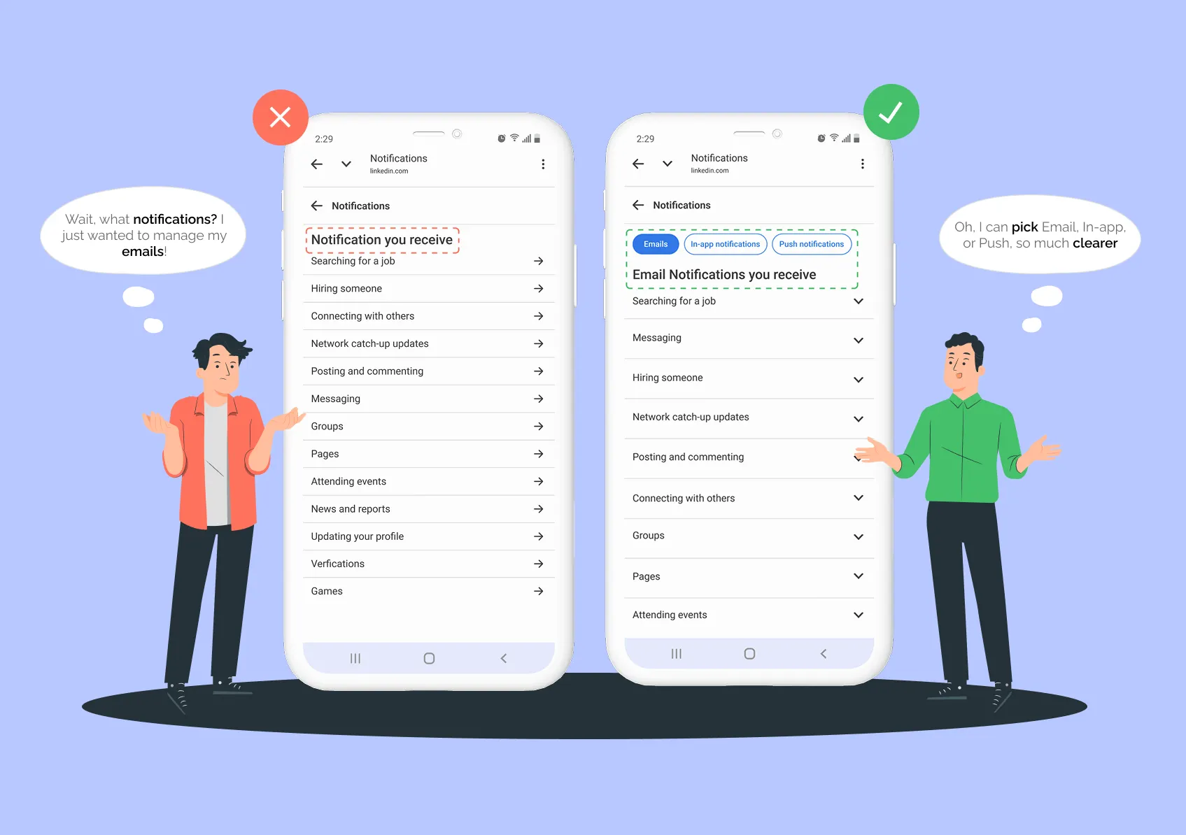
Clear Separation of Notification Channels
Problem statement
In the original design, users had to click through several pages just to adjust notification settings for each category and channel. There was no clear distinction between emails, push notifications, and in-app notifications. This made it difficult for users to focus on the specific channel they wanted to manage.
Redesign
The redesigned interface introduces dedicated sections for each notification channel: Emails, In-app notifications, and Push notifications. Users can now select right away which type of notification they want to manage. This makes the process much simpler and less confusing. Having this clear separation helps users focus only on the channels that matter to them, making it easier and more efficient to adjust their preferences.
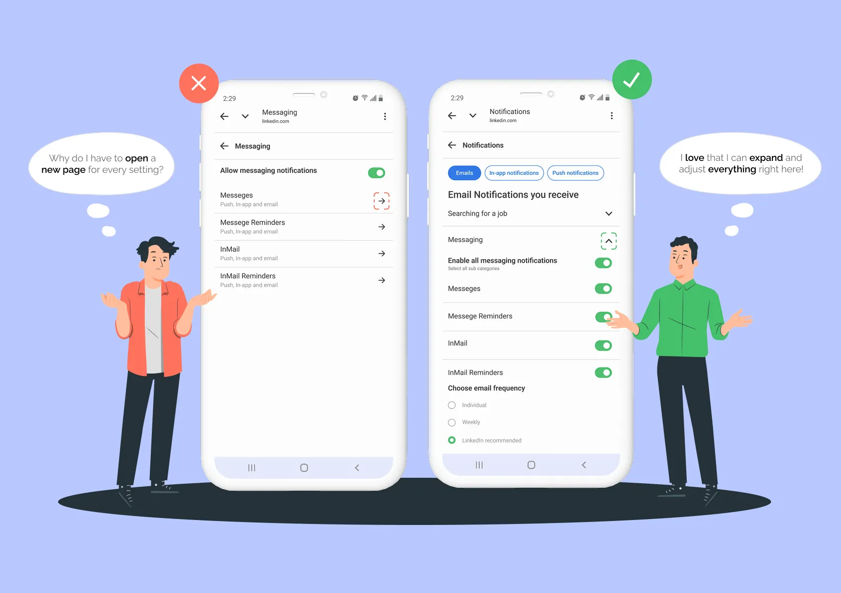
Expandable In-Page Sections
Problem statement
In the previous design, users had to go to separate pages for each notification category by clicking arrows. This broke up the experience and made it harder to keep track of changes. Moving between pages again and again made the whole process feel more complicated and tiring than it needed to be.
Redesign
In the new design, each notification channel has expandable sections for every category. Users can simply click a down arrow to expand or collapse categories right on the same page. This lets them adjust toggles and frequency settings without ever leaving the page. With everything visible and easy to access, users do not lose their place or have to remember what they changed elsewhere. By keeping all the controls on one screen and reducing extra navigation, the process feels much simpler and less stressful.
Other Projects