WhatsApp UX Redesign

Overview
This project explores small but impactful UX improvements to WhatsApp, focusing on reducing everyday friction without altering the core experience users are already familiar with. The redesign is a self-initiated concept aimed at improving efficiency, clarity, and content management through subtle interface changes.
Problem
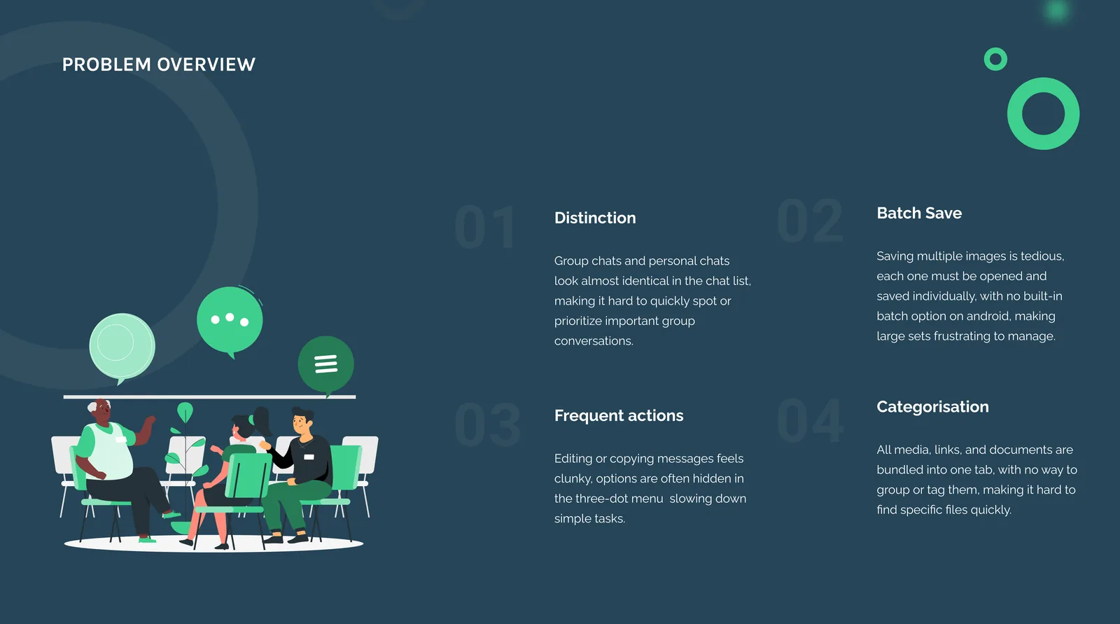
Despite being widely used, WhatsApp has several usability pain points that surface during daily use. Group chats and personal chats often look visually similar, making them hard to distinguish at a glance. Common actions like copying or editing messages require unnecessary steps, while saving multiple images is time-consuming. Media, links, and documents are all grouped together, making it difficult to quickly find specific content when revisiting chats.
Solution
The proposed solution focuses on making small, targeted UX changes that improve usability without disrupting existing user habits. By enhancing visual hierarchy, simplifying frequent actions, and improving content organization, the redesign aims to make WhatsApp faster, clearer, and more efficient while preserving its familiar interaction patterns.
Key Features
Clear Group Chat Differentiation
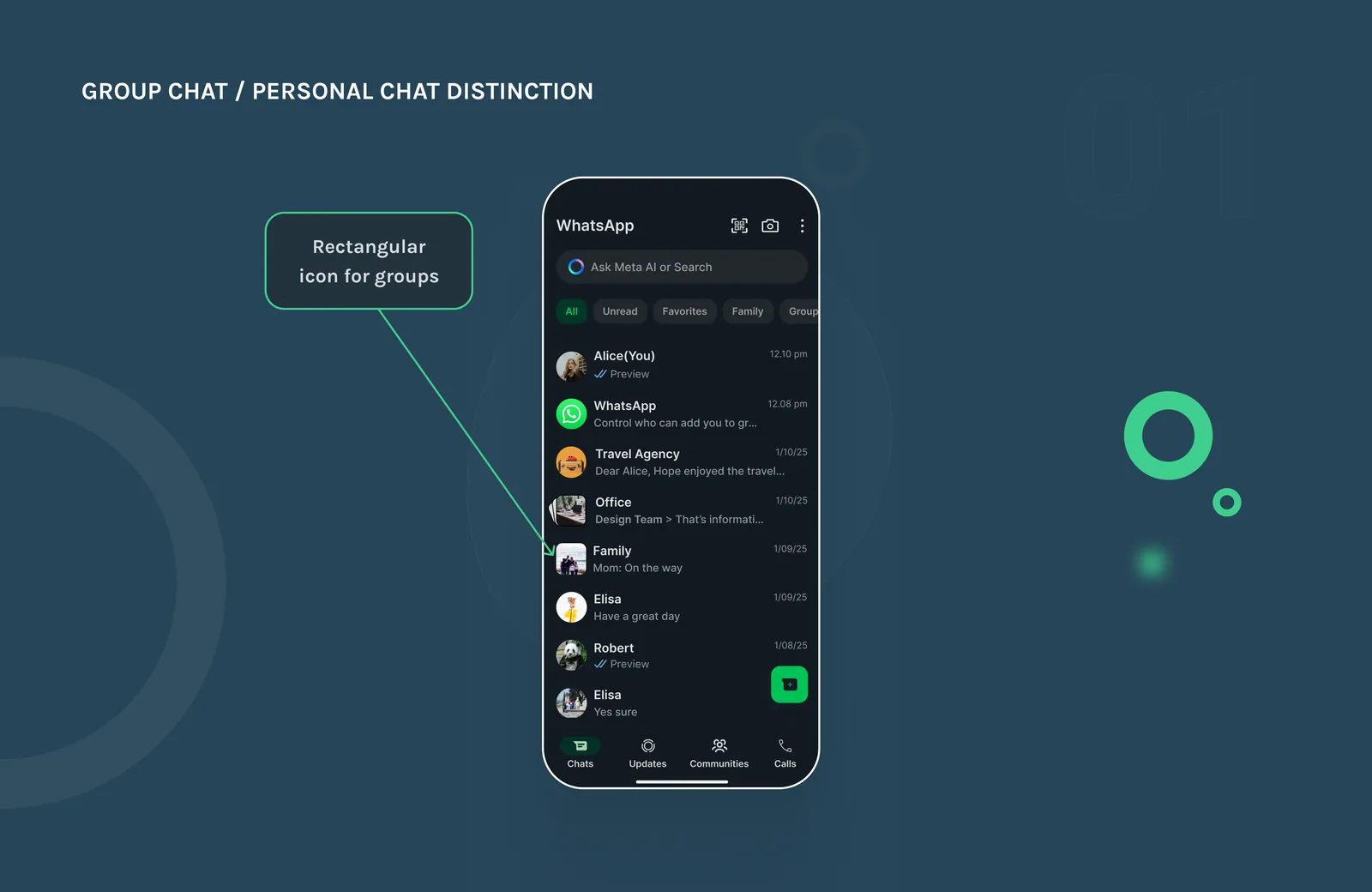
Problem statementIt's easy to lose track of group chats in WhatsApp because group and personal chats look nearly identical in the chat list. With the same rounded icons and layout, the only visual clue is a small group icon or the chat name, making it hard to quickly spot and prioritize group conversations.
RedesignI added a distinct rectangular icon to group chats to visually separate them from personal conversations. This small but effective change makes it easier to scan the chat list and quickly spot group messages, reducing confusion and helping users stay organized across both personal and group interactions. This ties into pre-attentive processing, the idea from Treisman's Feature Integration Theory that our brains notice shape differences before we consciously start looking, so a rectangular icon stands out faster than a rounded one.
Batch Media Saving
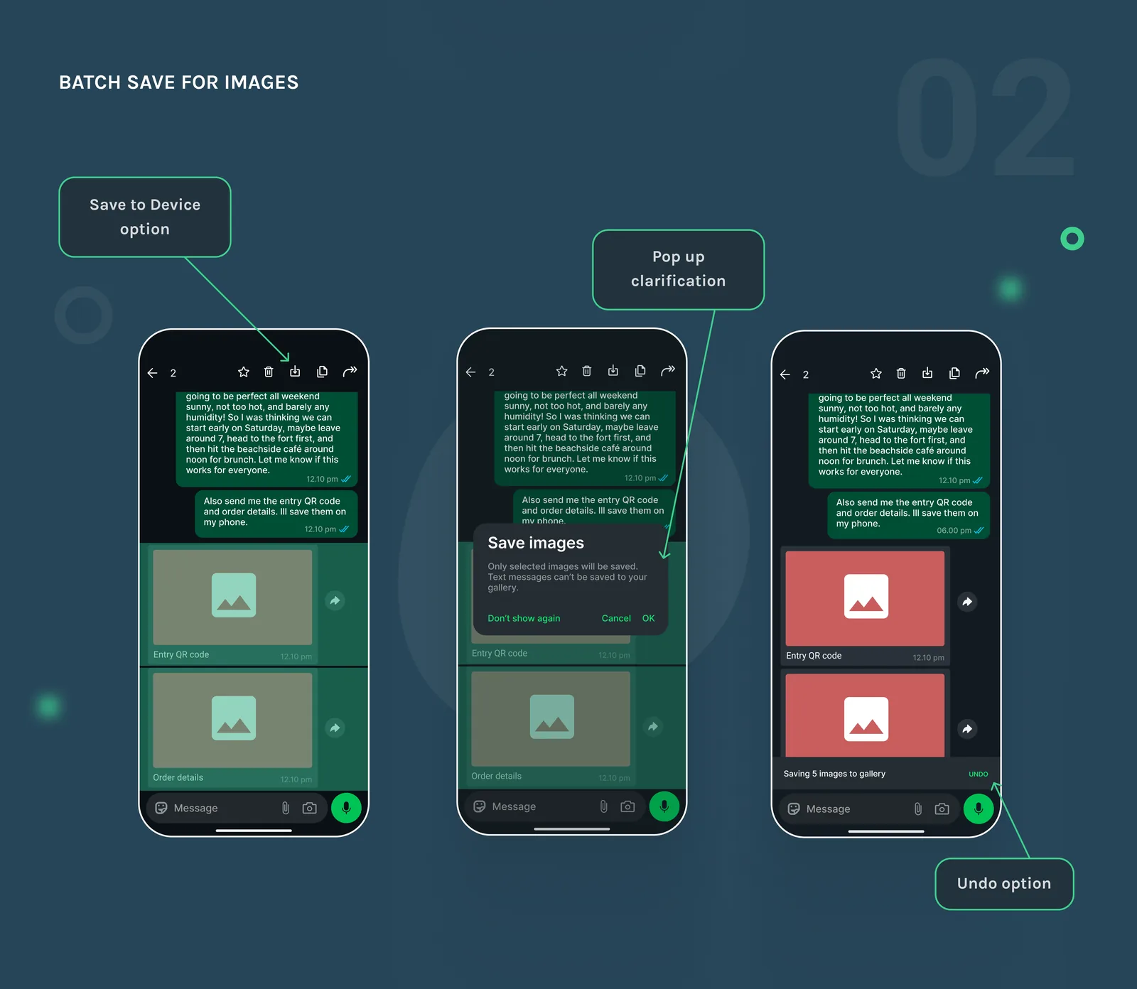
Problem statementSaving multiple images from a WhatsApp chat is frustratingly tedious. Users have to open each image individually, tap the three-dot menu, and hit save, again and again. There's no native batch save option in the chat view, and while iOS allows saving up to 5 at a time, Android doesn't support batch saving at all.
RedesignIn my WhatsApp redesign, selecting multiple images (up to 5 for technical consistency and to avoid accidental bulk storage) shows a Save option in the top action bar, so users don’t need to open and save each image one by one. This is especially useful for those who keep Media Visibility off to keep their gallery clean, allowing them to save only what they need. If a mix of images and text is selected, a pop up appears: "Save Images: Only selected images will be saved. Text messages can’t be saved to your gallery." After saving, an Undo toast appears for quick reversal if needed. The result is a faster, cleaner way to manage important photos from trips, events, or work chats. This lines up with Hick’s Law, since it says the time it takes to decide on something goes up with every extra choice or step, so turning several repeated save actions into one makes the task feel less draining.
Reduced Steps for Edit and Copy Actions
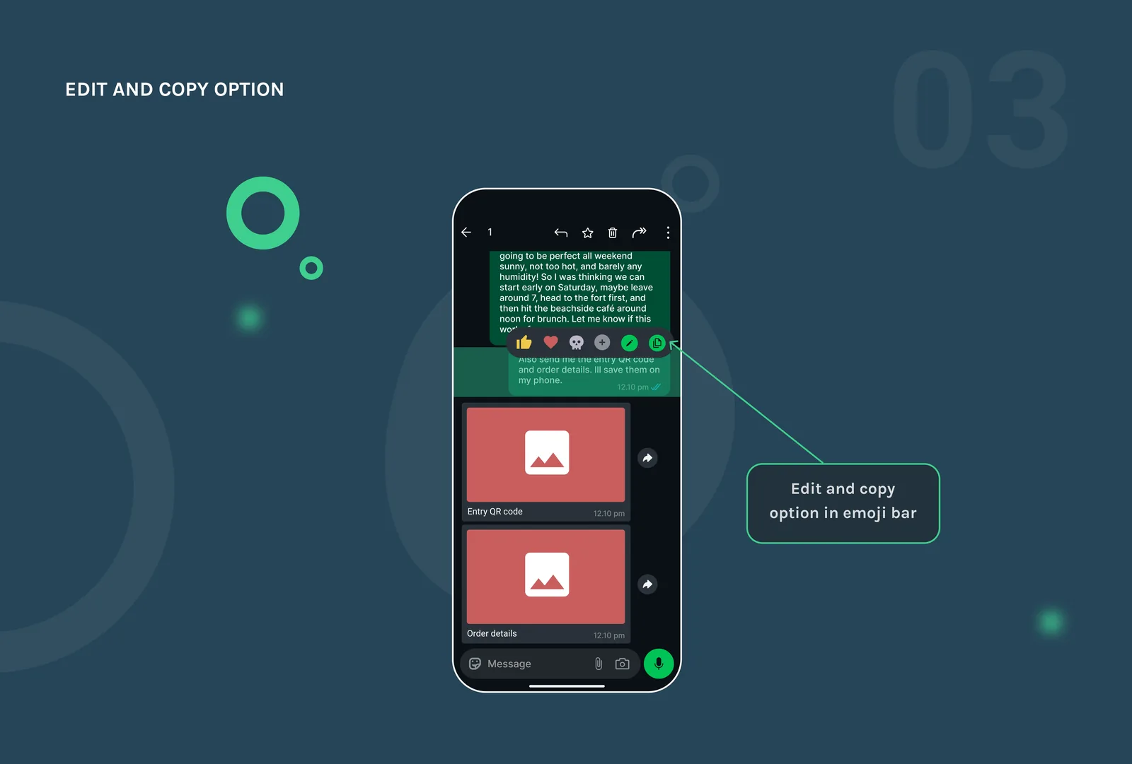
Problem statementEditing or copying a message should be effortless, but in WhatsApp it often takes too many steps. For each message, you need to tap the three-dot menu and then select the desired action, adding unnecessary friction to something that should be quick.
RedesignI placed the edit and copy actions directly in the emoji bar for single messages, eliminating the need to dig through menus. These actions are now more visible with distinct icons, making frequent tasks like fixing typos or copying information much faster and more intuitive. This connects to Fitts's Law, which says the time it takes to reach a target depends on its distance and size, so having the icons closer and clearer cuts down that reaction time.
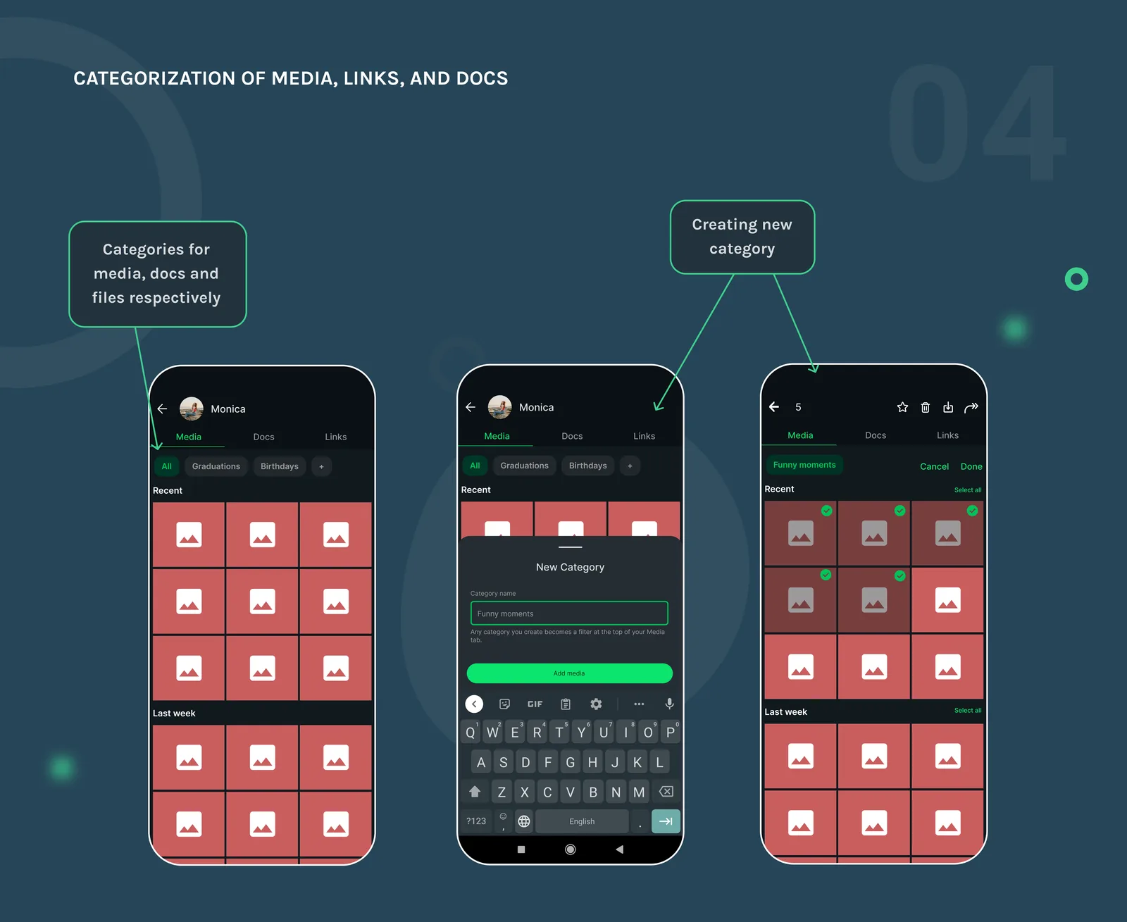
Personalized Categorization of Media, Links, and Docs
Problem statementWhatsApp dumps all your media, links, and documents into a single tab respectively per chat, displaying everything in one long, chronological list. If you're trying to find a specific photo, receipt, or file, you're stuck scrolling through the entire feed, with no folders, albums, or tagging options to organize or retrieve content more easily.
RedesignIn my redesign, I introduced the ability to save media into custom categories, like "Receipts," "Travel," or "Funny Moments." This allows users to organize important files and photos directly within WhatsApp, without cluttering their phone’s main gallery or using up Google Photos storage. It makes retrieving specific content quick and painless, eliminating the need for endless scrolling through a disorganized feed. This connects to chunking from Miller’s Law, which says our working memory can only hold about 4 to 7 items at a time, so sorting hundreds of files into a few labeled categories makes them easier to actually remember and find.